Recipe 012
We Had an AI Design Lead Audit This Site — Then Shipped Its Fixes
This site was designed by an AI. So we asked a different AI persona — a design lead with strong opinions — to audit it. Here's the full report card, the five fixes we shipped with before/after screenshots, the reasoning behind each one, and the two suggestions we refused.
Full disclosure, longtime readers already know: this site was designed and built by Claude. Which raises an uncomfortable question — who checks the cook's plating? This week we ran an experiment: we gave the site to an AI design lead and asked for an honest audit.
Not a vague "make it prettier" prompt. We used a design-review persona (in Claude Code, a design skill that behaves like the lead at a small studio — opinionated about typography, color, hierarchy, and restraint), handed it live screenshots of the site at desktop and mobile widths plus the design tokens, and asked it to grade five things: typography, color, spacing, distinctiveness, consistency.
Then we shipped the fixes it convinced us of — and refused the ones it didn't. Every change below shows the before, the after, and why the auditor flagged it.
What the audit praised (worth knowing what "good" looks like)
Before the red ink, the report card's passing grades — useful because they name what to protect during any redesign:
- The signature is real. The auto-typing prompt box in the hero, and the slug-generated bento art on every post, make the site recognizable at a glance. The auditor's note: "spend boldness in one place — this site has a place."
- The quality floor holds: visible keyboard focus,
prefers-reduced-motionsupport, one consistent shadow language (hard offset, ink-colored) across every button and card. - The palette is disciplined: five named colors doing five jobs — cobalt for links and action, butter for emphasis, paprika for warnings and personality, herb for success, porcelain underneath everything.
Fix 1: the homepage buried its most important fact
The finding: "Structure is information. On a blog's homepage, the single most important fact is 'what's new' — and your six identical tiles hide it. Recency should read as hierarchy, not as a date stamp in 11px mono."
The card grid treated the newest recipe exactly like the sixth-newest. So the newest post now gets a wide, featured slot above the grid:
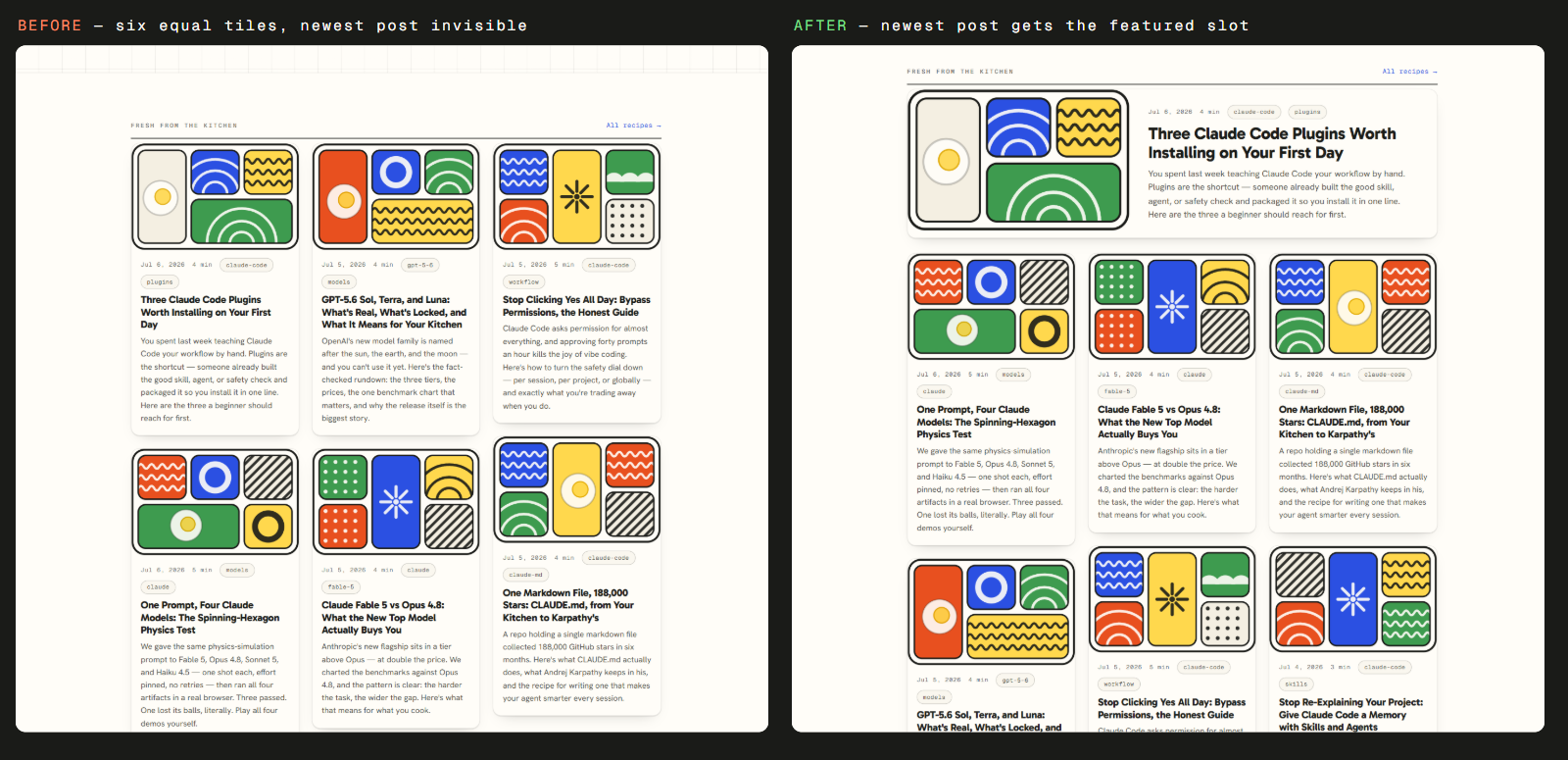
The featured card borrows the newspaper logic the design already gestured at: one lead story, then the rest of the page. Nothing else about the cards changed — the hierarchy alone does the work.
Fix 2: when everything is highlighted, nothing is
The finding: "The hero sentence highlights three phrases. Three highlights compete with each other and with the prompt box below — which is the actual signature. Keep one."
Guilty as charged: our tagline butter-highlighted vibe coding, automations, and prompts that behave. The audit's Chanel rule — look in the mirror, remove one accessory — applied twice. We kept the single most brand-specific phrase:
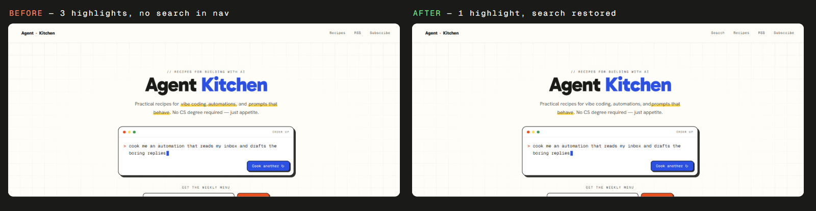
The hero is measurably calmer, and the prompt box — the thing we actually want your eye on — wins the frame again.
Fix 3: the search feature nobody could find
The finding: "You have a working search page, a search action advertised to Google in your structured data — and no way for a human to reach it. A feature that exists but can't be reached is a broken promise."
This one was embarrassing. During a recent nav cleanup, the search link fell out of the header — but /search kept working, and our SEO markup kept telling crawlers the site is searchable. Machines could find our search; people couldn't. One nav link restored (visible in the after shot above).
The general lesson the auditor attached: after any redesign, walk every feature's entry path. Pages don't disappear when their links do — they just become orphans.
Fixes 4 & 5: the quiet ones you'd feel but never name
Two smaller findings, shipped without ceremony:
- Heading scale in articles. Section headings (h3) were 1.18rem against 1.08rem body text — "a whisper of hierarchy," per the audit. Readers scan; headings must assert. Now h2 is 1.62rem and h3 is 1.28rem, a clear two-step ladder above the body.
- Meta-text contrast. Our dimmed gray (
#6f7068) sat at a 4.9:1 contrast ratio on the porcelain background — technically passing, but used at 11px uppercase mono, the hardest possible setting to read. Darkened to#63645c(~5.5:1). Nobody will notice the change; everybody gets slightly easier dates and tags.
What we refused, and why refusing matters
An audit you accept wholesale is just outsourcing your taste. Two suggestions we declined:
- "The bento art is loud — consider shrinking it on cards." True, six bentos at full volume is a lot of pattern. But the bento is the brand; muting it to be tasteful would trade recognition for politeness. The featured-card change already reduces how many tiles shout at once. Declined, deliberately.
- "Consider a serif display face for editorial warmth." That's the default move of every AI-adjacent redesign in 2026 — cream background, high-contrast serif. Gabarito's rounded sans is the kitchen's personality. Declined without a second thought.
Order up
Run the same audit on your own project. Paste this into your agent along with screenshots of your site (or let it take its own):
Act as the design lead at a small studio known for distinctive, opinionated work.
Audit this site's design: typography, color, spacing, hierarchy, distinctiveness,
and consistency.

Rules:
1. Start with what works and must be protected — name the site's signature.
2. For every finding, state the design principle it violates and the smallest
   change that fixes it. No redesigns, no "consider a fresh look."
3. Check the quality floor: keyboard focus, reduced motion, contrast ratios,
   and whether every feature still has a reachable entry point.
4. End with anything you'd recommend I refuse, and why I might refuse it.
That last rule is the one that makes the audit trustworthy — a critic who tells you what not to change is a critic with a point of view.
So: scroll back up to those before/after shots one more time. Which side looks better to you — before, or after? Tell us on X @AgentKitchenHQ. If enough of you vote "before," we'll eat our apron and roll it back — that's what version control is for.